
I was diagnosed with ADHD in first grade, and from that moment I felt like I was put into a box, pushed to the side for being too much, too wild, too out of control. But underneath all of that was a girl who was wildly creative, who cared deeply, and who simply wanted to be seen.
Coming into college, and stepping into the confidence I have now, I have learned to embrace those parts of myself instead of hiding them. I have also grown passionate about celebrating the stories of others who have felt misunderstood or mislabeled.
Senior capstone
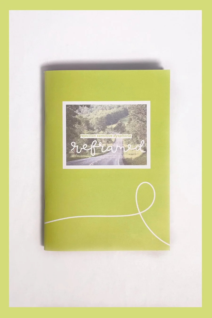
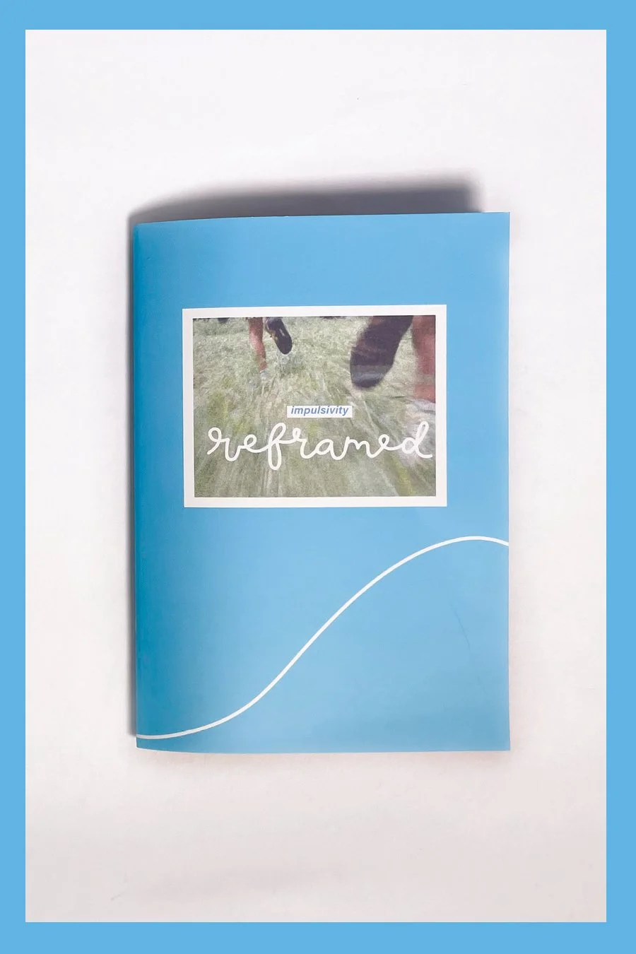
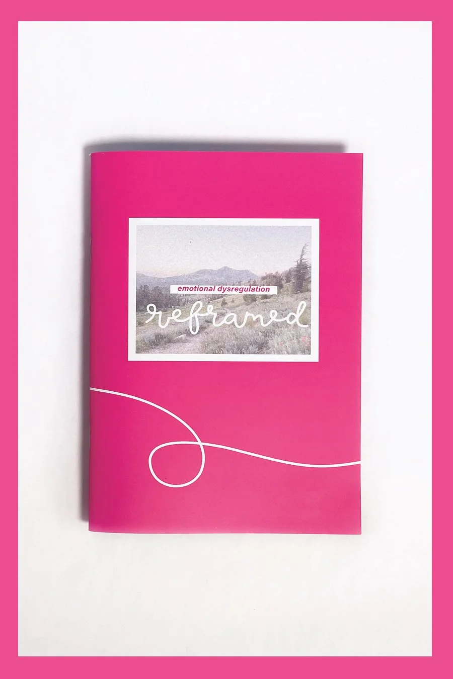
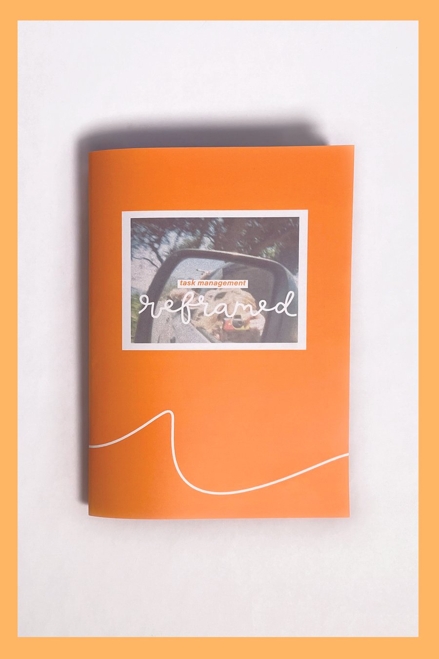
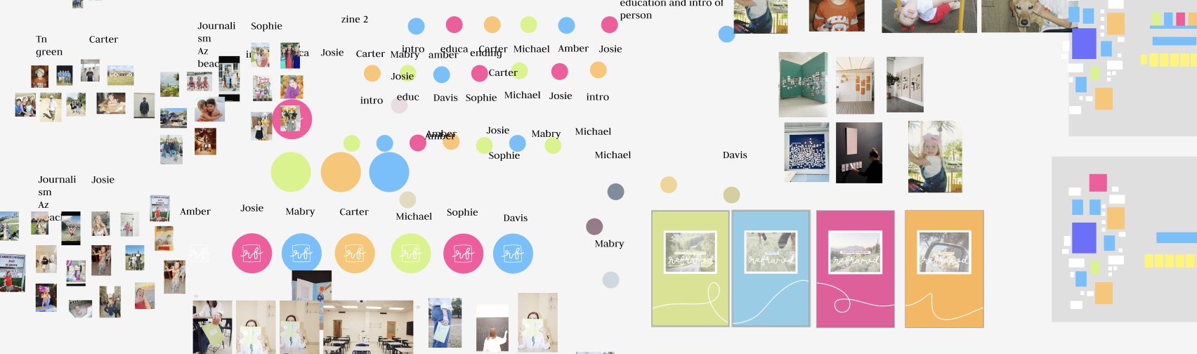
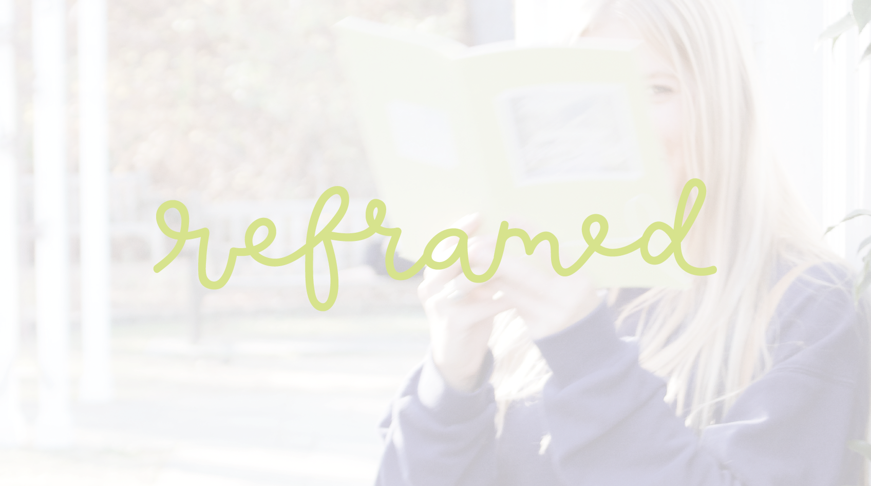
Reframed is my creative platform to share those stories. It creates four different books that feature people’s experiences and capture who they are as individuals. Each book highlights both their struggles and their achievements, bringing awareness to the reality of living with ADHD. The goal of this project is to help people understand what ADHD really looks like. Each book focuses on a different aspect of ADHD, offering multiple perspectives and showing that it does not look the same in everyone.
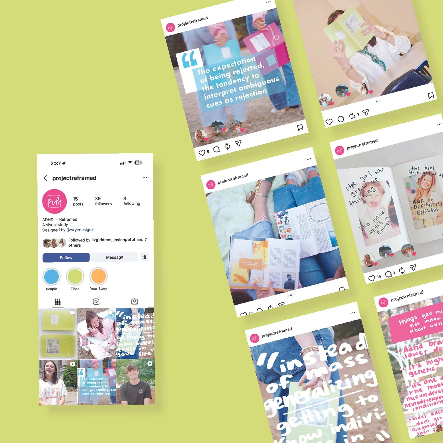
To deepen the impact of these stories, I also collected interview clips and created an emotional and meaningful video that allows viewers to hear these voices directly. This adds a layer of honesty and connection that design alone cannot achieve.
Through design, storytelling, and vulnerability, my mission is to help people feel seen, understood, and reframed in the light they deserve.
what is reframed
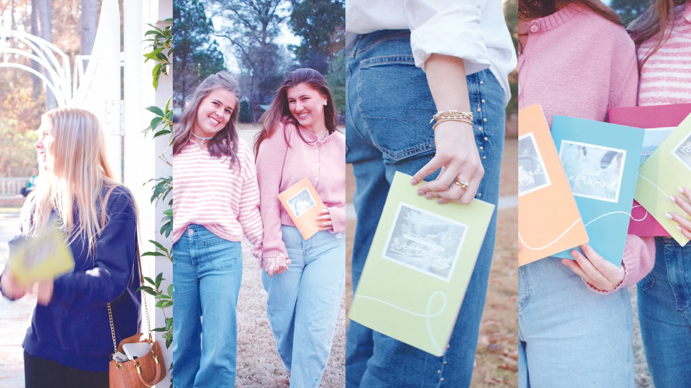
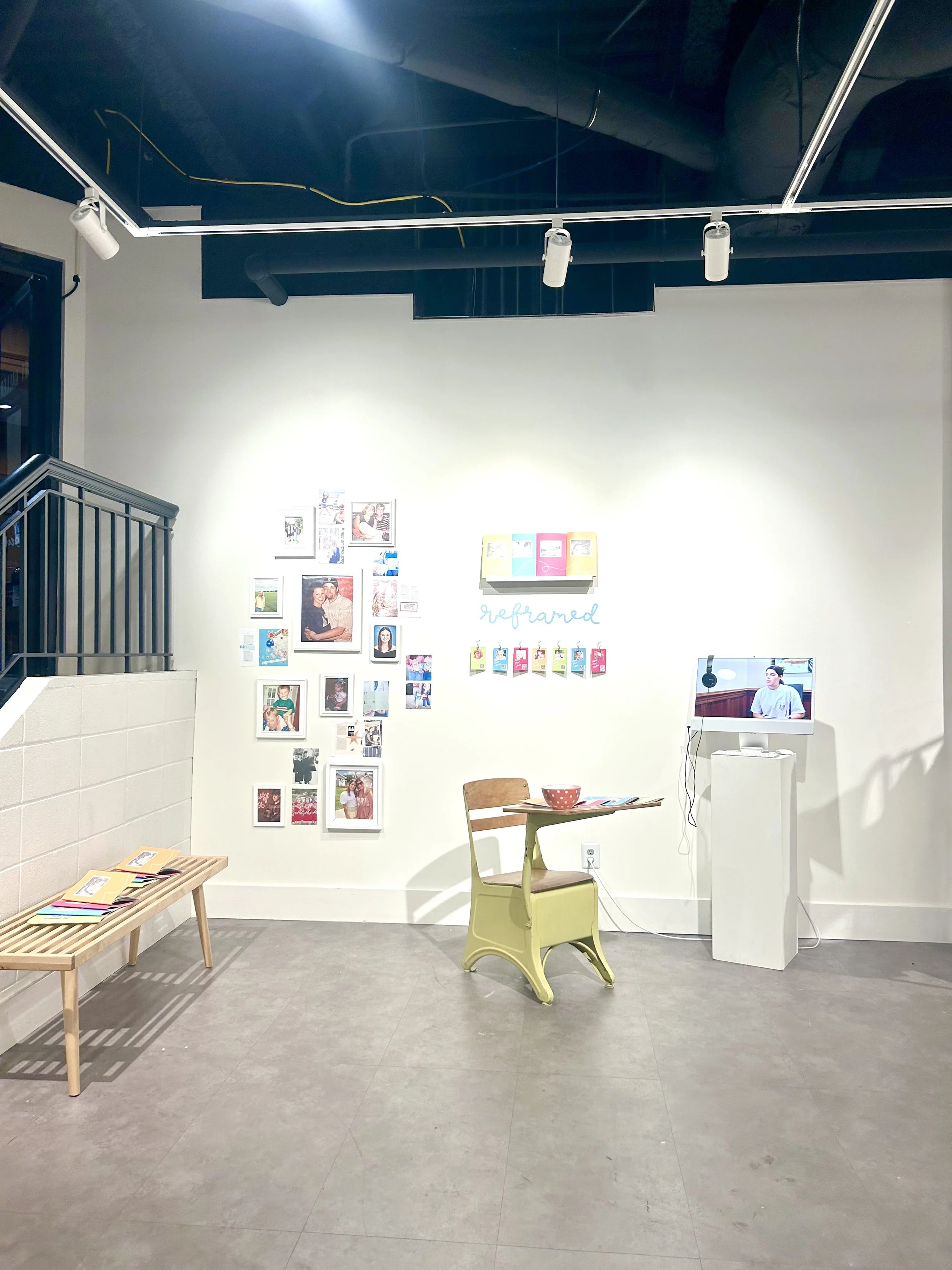
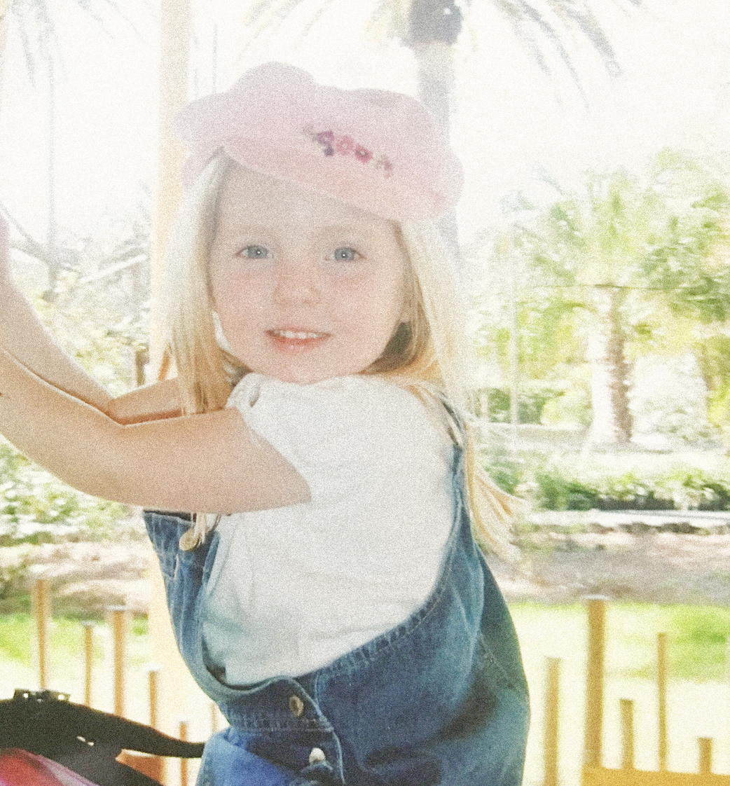
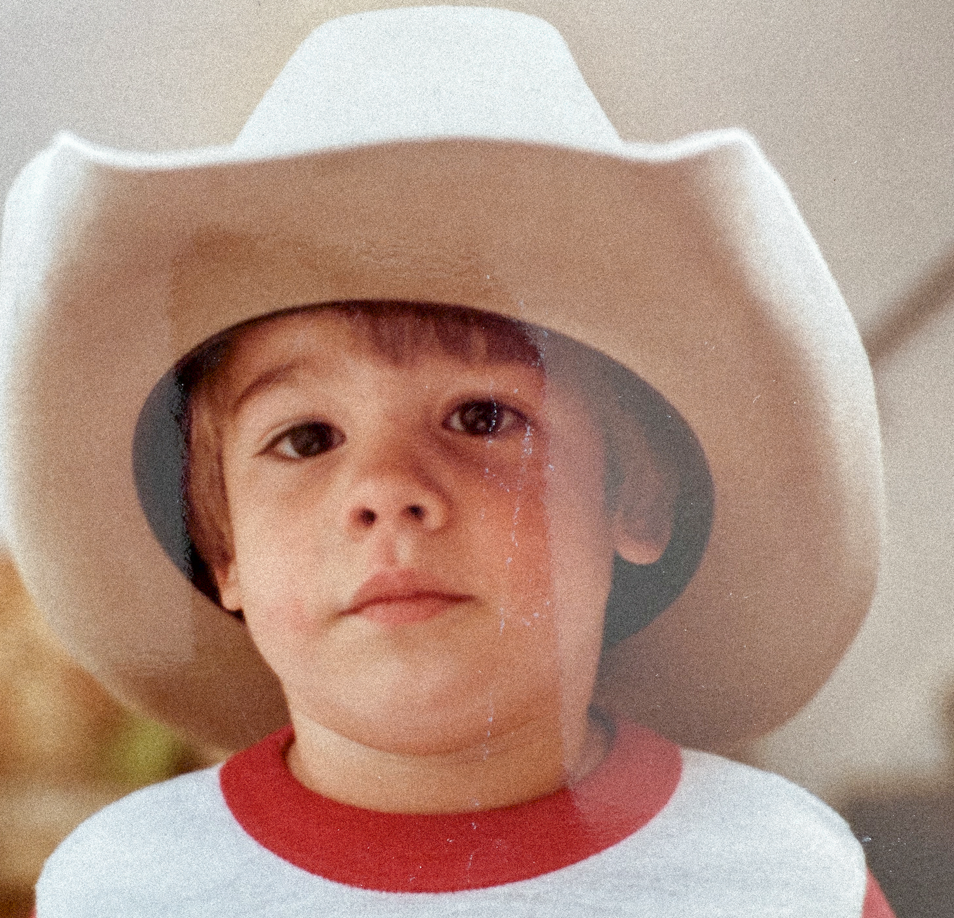
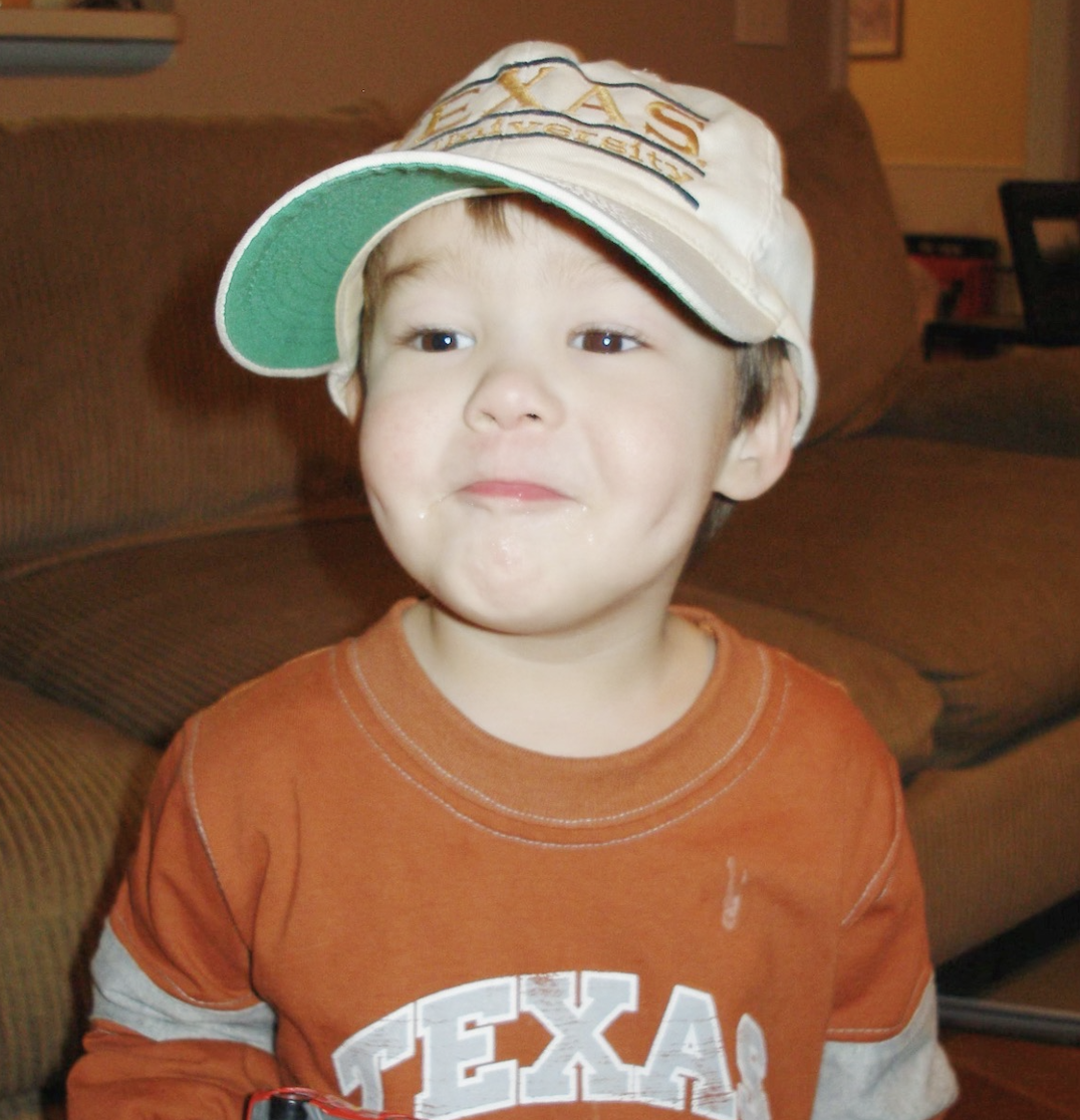
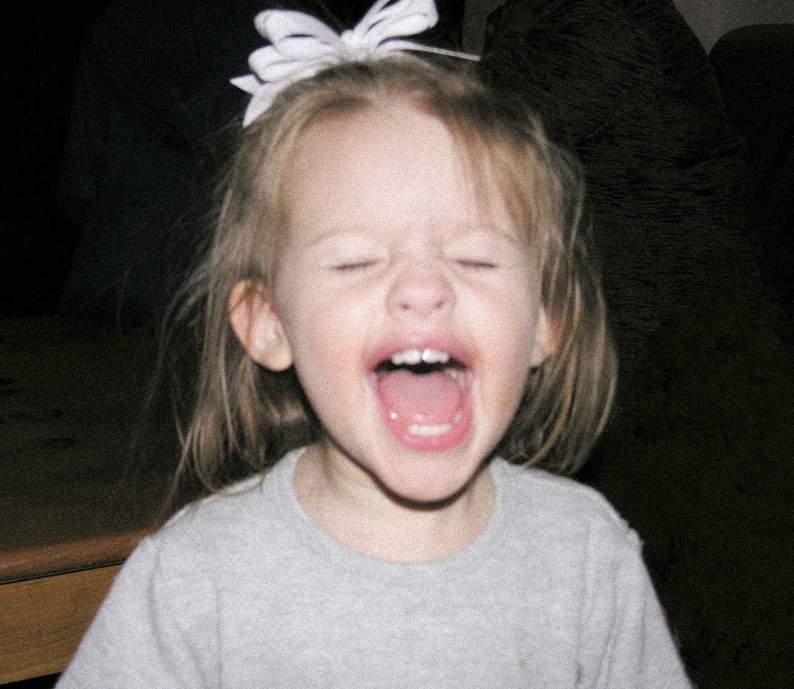
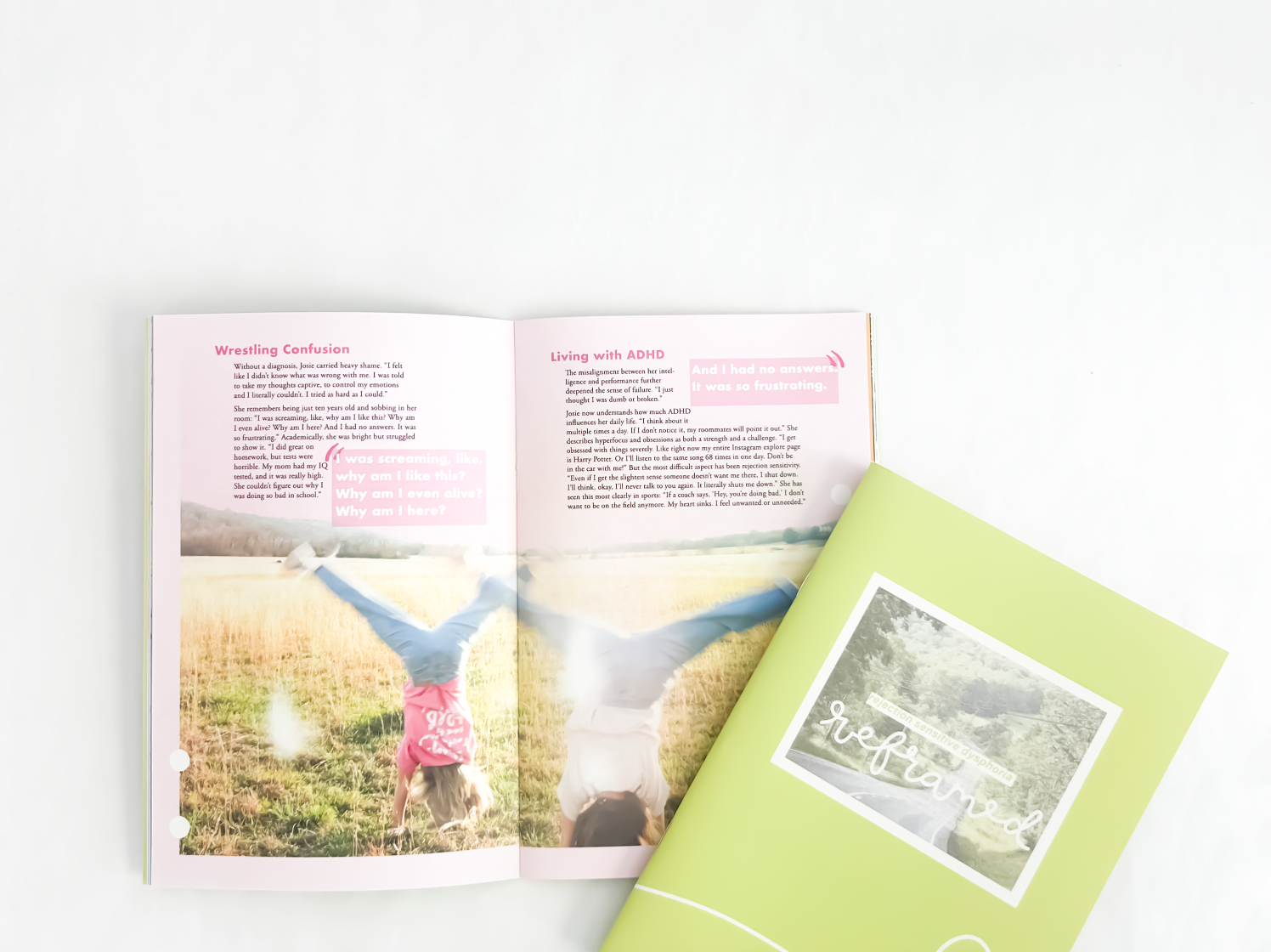
Reframed is my creative platform to share those stories. It creates four different books that feature people’s experiences and capture who they are as individuals. Each book highlights both their struggles and their achievements, bringing awareness to the reality of living with ADHD. The goal of this project is to help people understand what ADHD really looks like. Each book focuses on a different aspect of ADHD, offering multiple perspectives and showing that it does not look the same in everyone. Reframed is built around intentional visual storytelling, with each design choice reinforcing individuality and emotional tone. I incorporated baby photos as anchoring elements to create contrast between origin and present identity, allowing the layouts to visually reference growth and change without relying solely on text. The softness and nostalgia of those images influenced spacing, scale, and pacing across spreads.
Each person in the series was assigned a distinct color palette that carried consistently from cover to interior details. These color systems acted as visual identifiers, creating cohesion while ensuring every section felt unique. Typography, margins, and image treatments subtly shift within each zine to reflect personality, so no two sections feel templated. The result is a series that functions as one unified system while still allowing every page to feel intimate, personal, and intentionally crafted.