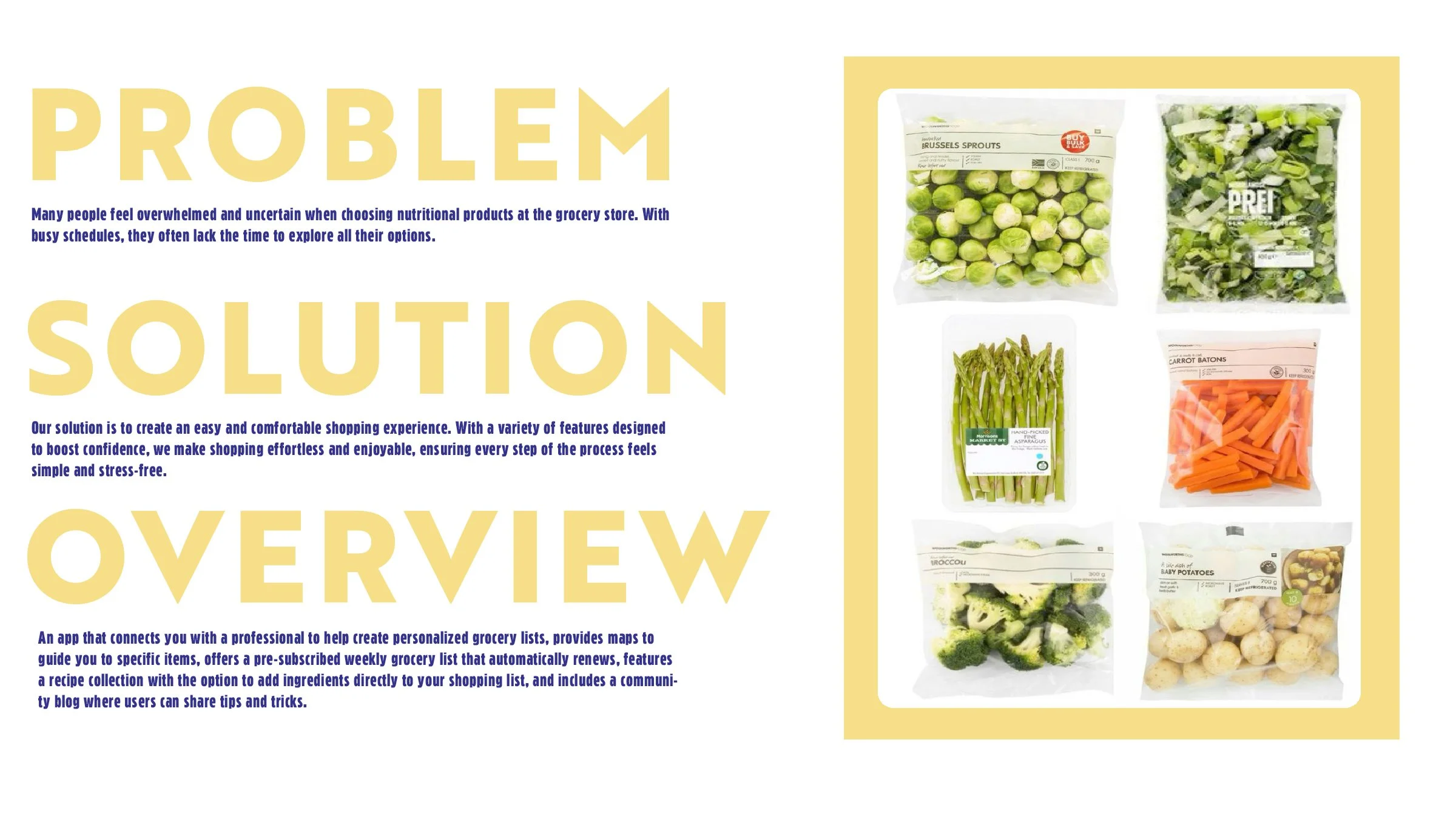
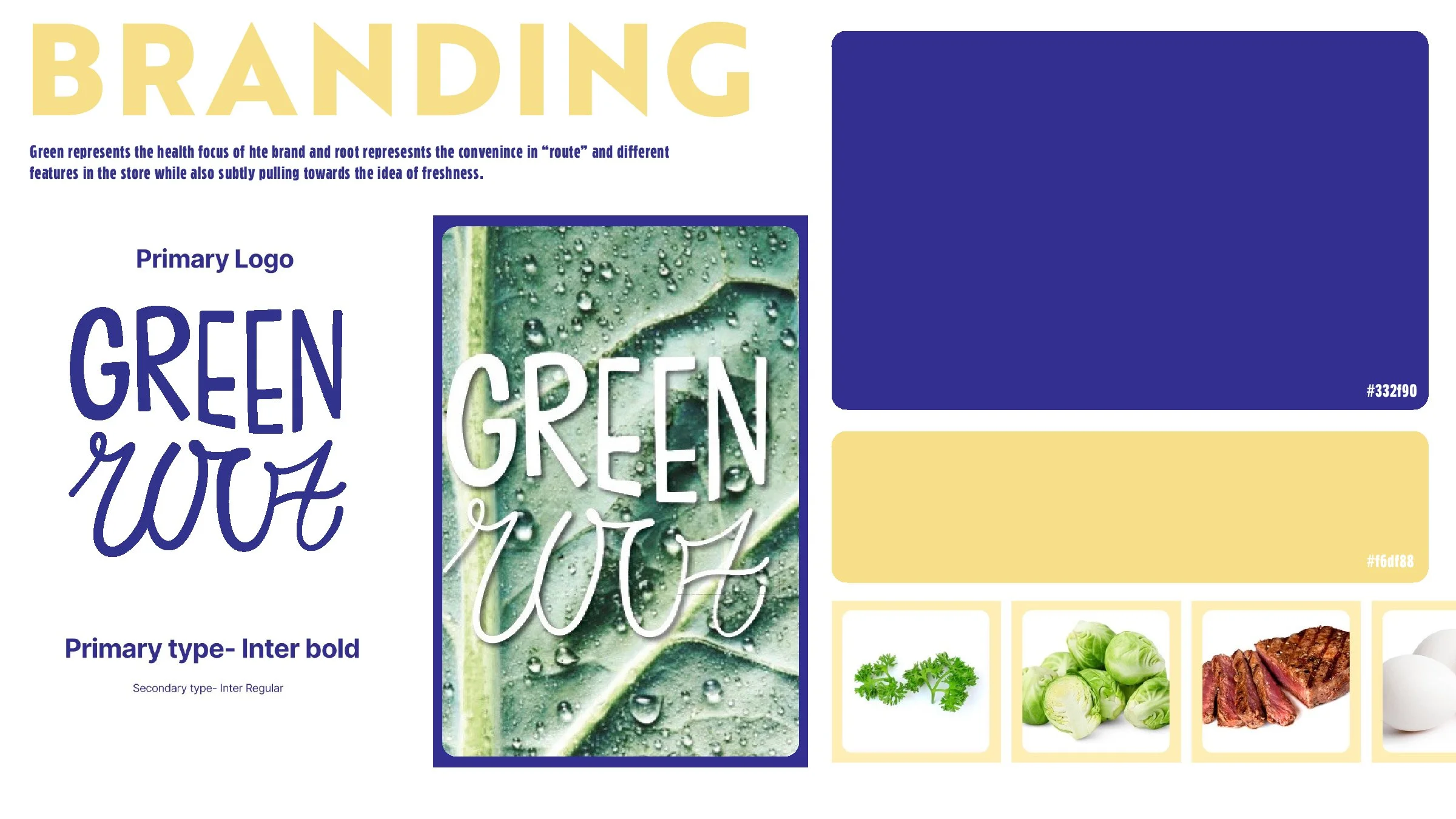
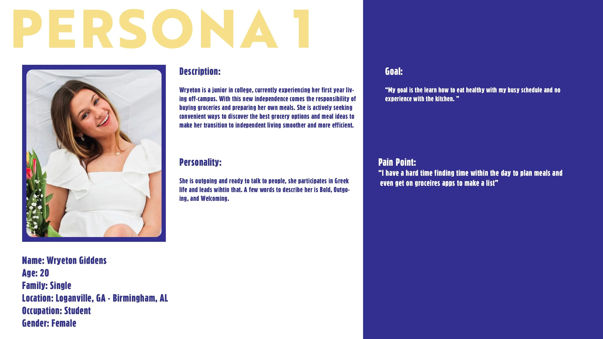
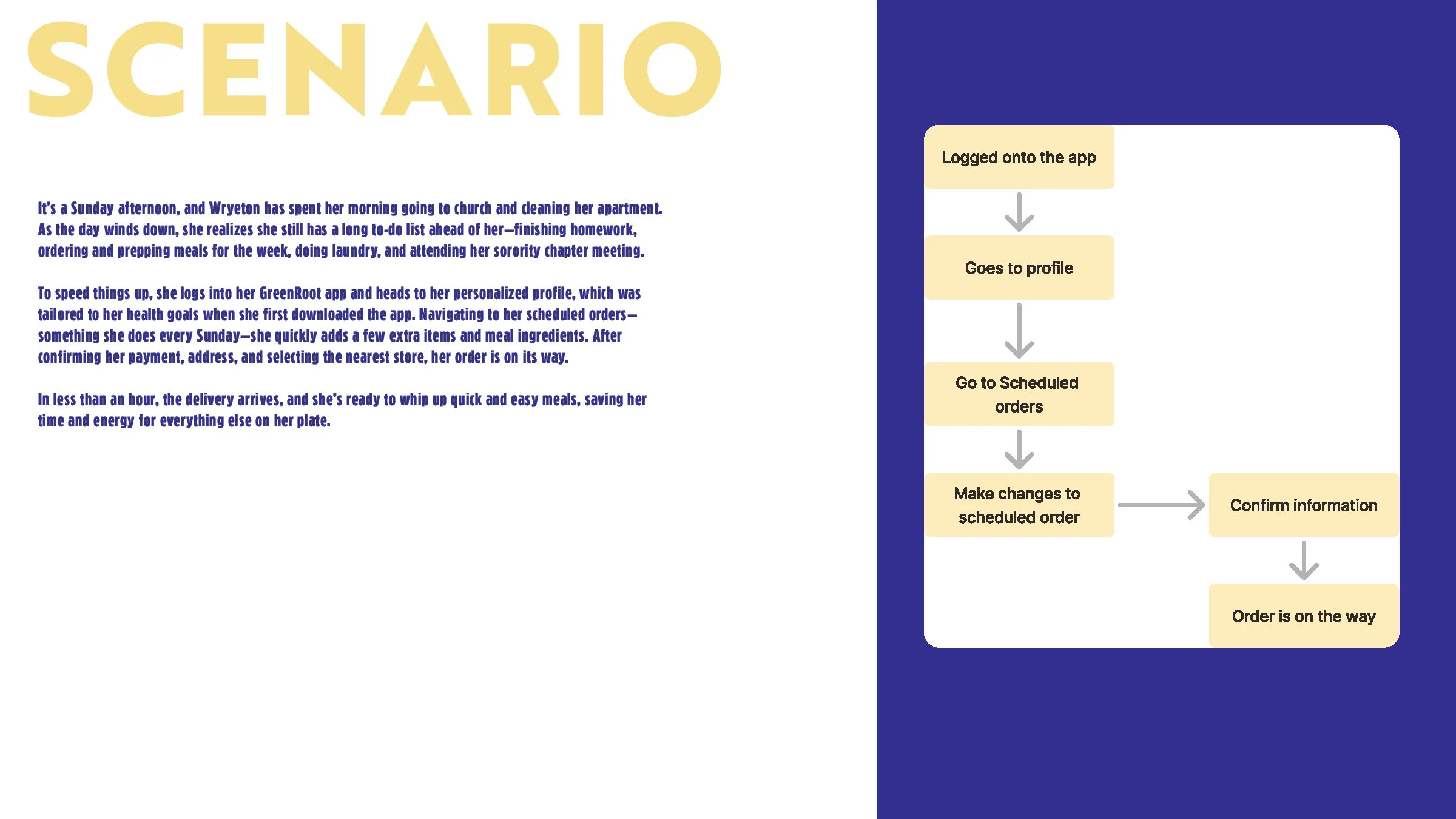
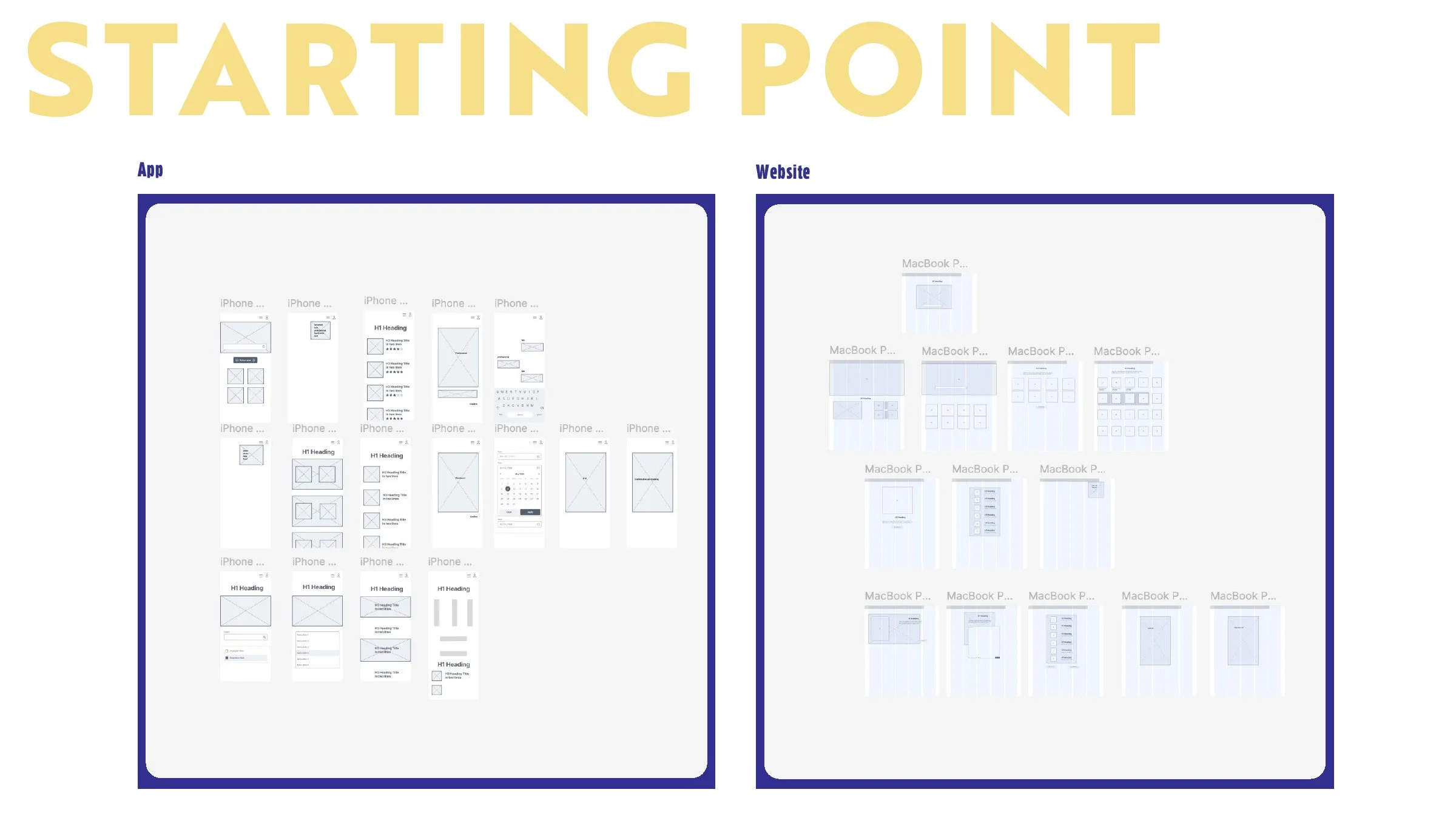
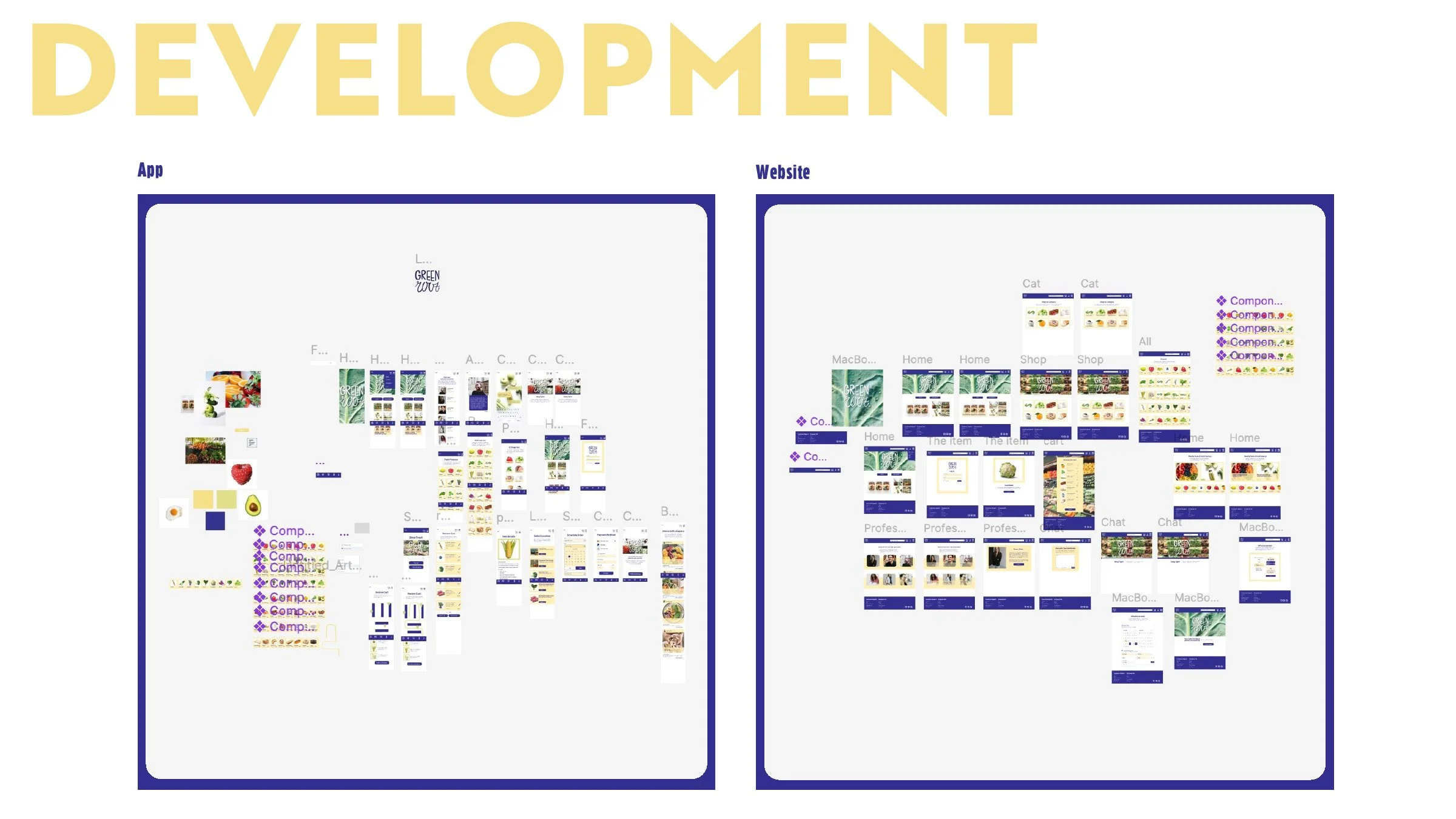
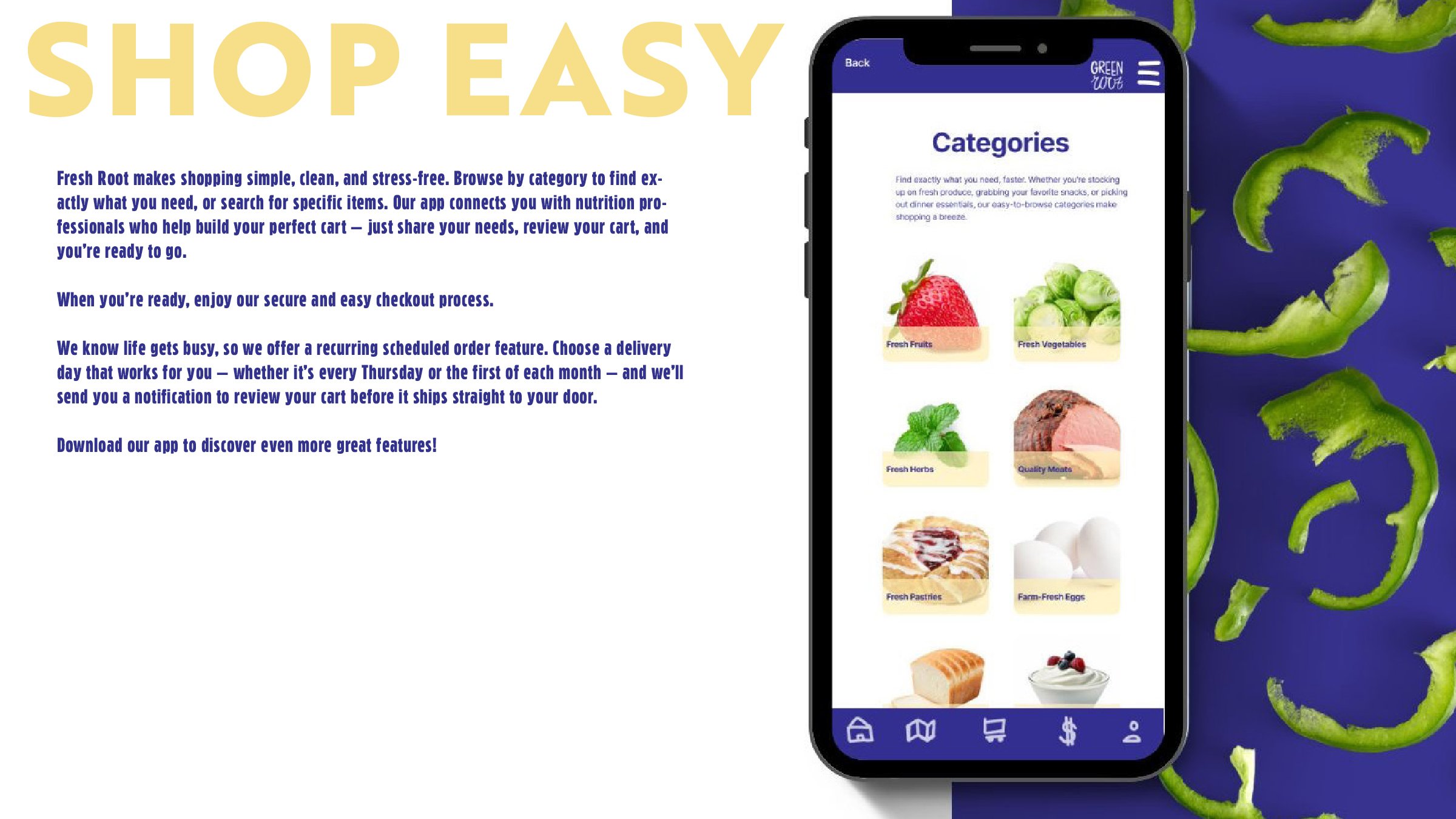
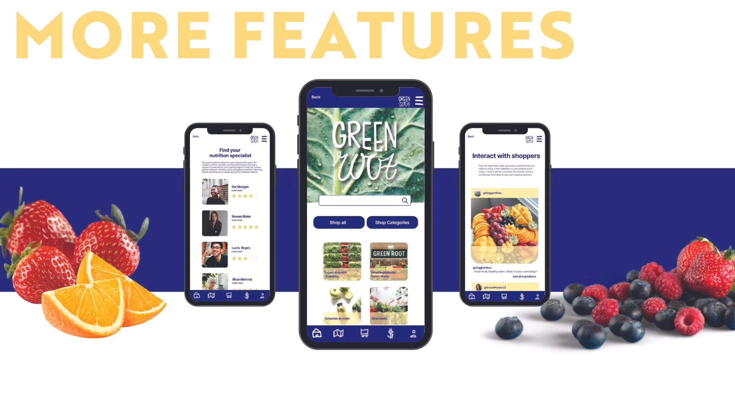
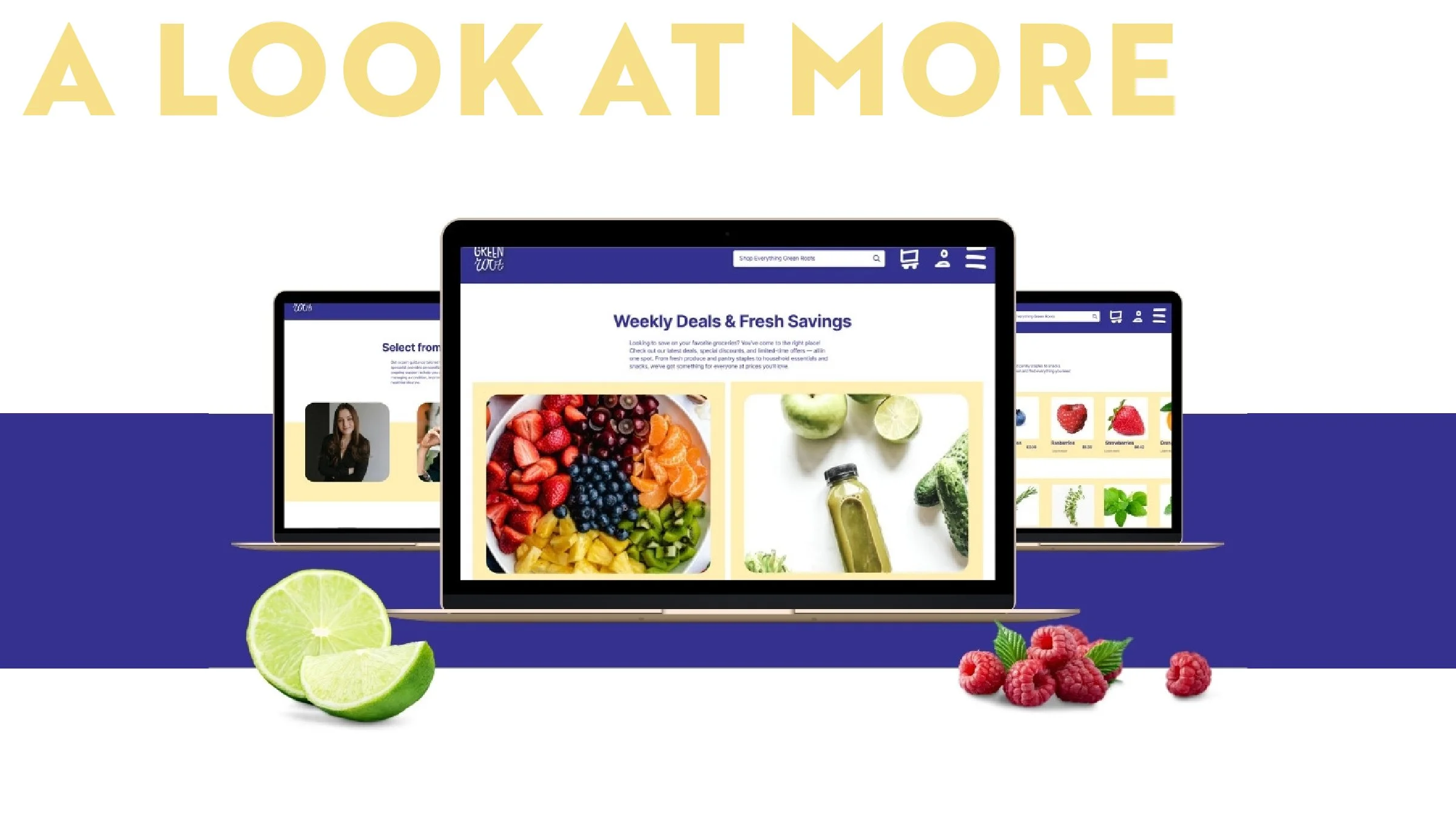
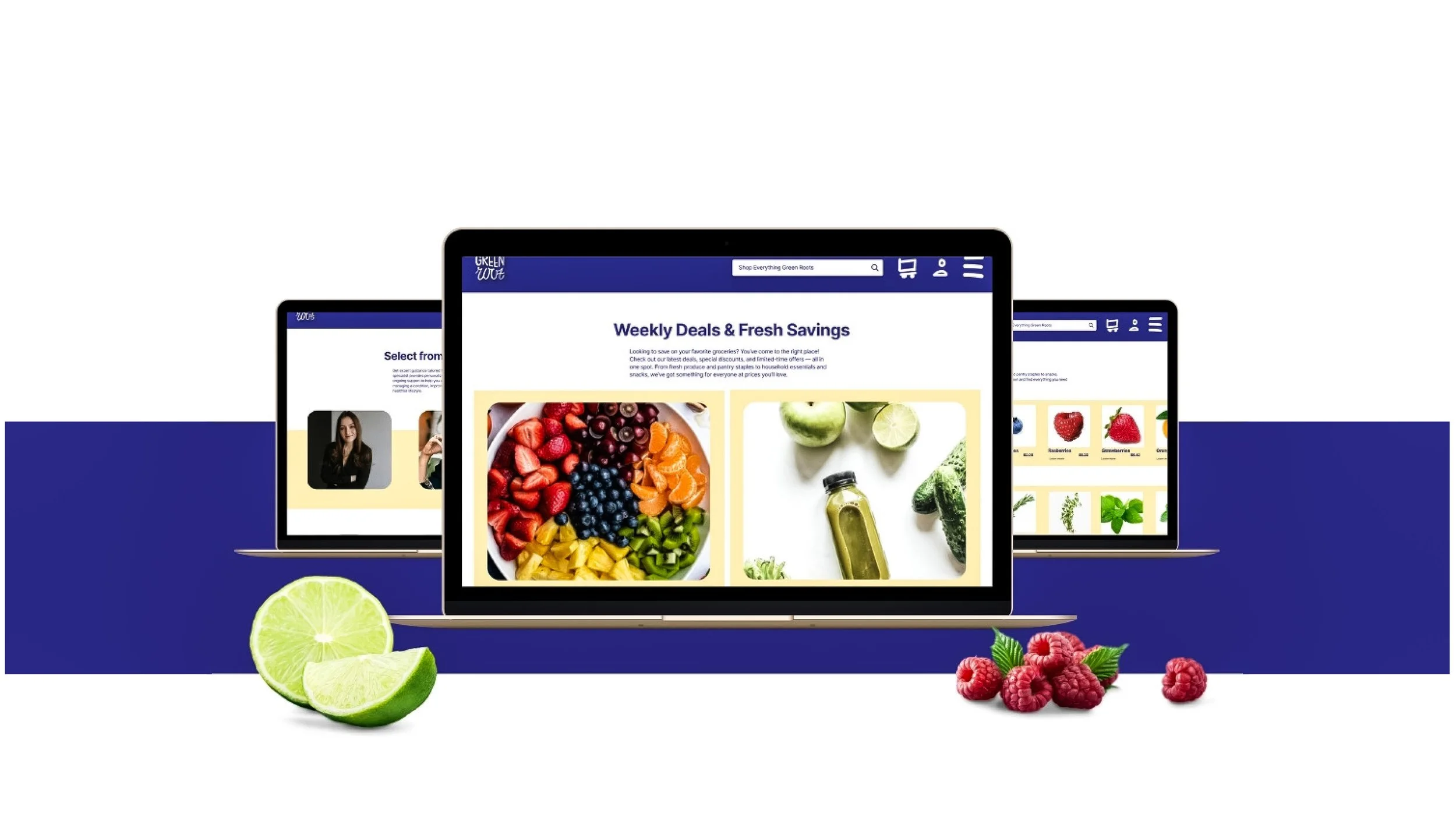
For this advanced UI project, I conducted an in-depth brand study and developed a comprehensive digital experience for Green Root, a concept focused on making grocery shopping as simple and efficient as possible. The project involved researching user behavior, defining brand positioning, and translating those insights into an intuitive interface system. I designed streamlined navigation, clear visual hierarchy, and user-centered features that prioritize speed, accessibility, and ease of use. The final result presents Green Root as a thoughtfully crafted platform where grocery shopping is optimized to the fullest extent through purposeful, research-driven design.

Green root

  • A graphic with the title 'PROBLEM SOLUTION OVERVIEW' in large yellow letters. The left side contains text explaining the problem of feeling overwhelmed at grocery stores and the solution of an app for grocery shopping. The right side displays six grocery items in plastic bags, including Brussels sprouts, mixed greens, asparagus, carrots, broccoli, and baby potatoes, framed by a yellow border.
  • Branding board with the primary logo in bold etters on a leafy background with water droplets. Color palette includes a dark blue (#332f90) and a light yellow (#f6f8f8). Below are images of cilantro, brussels sprouts, a steak, and eggs, depicting healthy ingredients.
  • A woman with light brown hair, wearing a white dress, smiling and holding a bouquet of flowers alongside a background of greenery. The layout shows personal information about her, including her name, age, family status, location, occupation, and gender, along with a description, personality traits, goal, and pain point.
  • A two-column layout on a digital screen. The left column has a scenario description titled 'It's a Sunday afternoon...' in blue text on a white background. The right column is a flowchart with steps in beige boxes on a dark blue background, illustrating a process for ordering food via an app, starting with 'Logged onto the app' and ending with 'Order is on the way.'
  • Profile information card for Elizabeth Giddens, a 45-year-old female school principal from Loganville, Georgia. The card includes a photo of Elizabeth smiling, a description of her daily routine, personality traits, a goal to save time and money, and a pain point about online ordering delays.
  • Profile card for Elizabeth Giddens, a 45-year-old female school principal from Loganville, GA. Features her photo, personal details, description, personality, goal, and pain point.
  • A graphic with a scenario description on the left side and a flowchart of steps on the right side. The scenario describes a woman named Elizabeth shopping online for recipes after a long day, and the flowchart shows steps like logging into an app, browsing recipes, adding ingredients, and placing an order.
  • A profile page for Person 3, featuring a smiling man with dark hair and a beard wearing a blue shirt. Details include his name Kai Martin, age 27, family engaged, located in San Diego, California, occupation private equity investor, and male gender. The page describes him as a hardworking, ambitious person who enjoys working late and taking his fiancée on dates when free. His goal is to gain 30 pounds of muscle and stay healthy, with a pain point being very specific goals he doubts can be met.
  • Flowchart illustrating the process of ordering meal plans online, starting from logging onto the website, entering personalized goals, consulting a nutritionist, reviewing and approving the list, and finalizing the delivery.
  • A digital wireframe or mockup board with the title 'STARTING POINT' in large yellow text at the top. The board is divided into two sections labeled 'App' on the left and 'Website' on the right, outlined with dark blue borders. The 'App' section contains wireframes of iPhone screens including layout and UI elements. The 'Website' section contains wireframes of MacBook screens with layout designs.
  • A visual display showing the development process of a project titled 'Green' from app to website, with layouts of various screens and interface elements.
  • A graphic advertising a grocery shopping app  with an image of a smartphone displaying the app's categories, including fresh fruits, vegetables, herbs, meats, pastries, and eggs. The background features sliced green peppers on a blue surface, and the left side contains promotional text about the app's features and benefits in yellow and blue fonts.
  • Three smartphones displaying an app called Green Wolf with features for shopping, nutrition, and interacting with shoppers, surrounded by strawberries, orange slices, blueberries, and raspberries.
  • Digital devices displaying online grocery deals for fresh fruits and vegetables, with limes and raspberries in front.
  • A digital screen with instructions for a usability test on the left side, and on the right side, a sliced watermelon with a background split between white and dark blue.
  • A presentation slide with the word 'TESTING' in large yellow letters at the top left. The slide contains a paragraph of text in blue, discussing website and app testing feedback and suggested improvements. To the right, there are four smaller images or mockups, each framed in blue, showing different screens related to a grocery app or website, labeled 'Green Wolf,' with headers like 'Hang Tight!', 'Select Location,' and 'Review Cart.'